IBM Connect Presentation Uploaded
At Connect last week, I presented a session on using grids in XPages with Paul Calhoun. Here’s a link to the slide deck
AD-1207: The Grid, the Brad, and The Ugly: Using Grids to Improve Your Applications
Do you want better features, better performance, and a better UI in your XPages applications? Then display your data in grids instead of built-in controls. In this session, Paul and Brad will demonstrate why grids are a significant improvement in general and cover why one size does not fit all. They will review the features of commonly-used JavaScript grid frameworks (including Dojo, jQuery, Kendo UI, and Sencha) in order to help you determine which is the best fit for your applications.
Dojo Data Grid – Part 36: Conditionally Preventing Cell Editing
With the editable property of a grid column, it’s easy to enable editing or even conditionally compute whether the entire column should be editable. In this post, I’ll show how to take finer control and dynamically determine whether to enable editing based on the contents within a cell.
Dojo Data Grid Series
Dojo Grids in XPages — All Blog Posts
canEdit Event
In short, you can use attach a function to the canEdit event of the grid to return true or false, based on whether you want the cell to be editable.
Interestingly, this function overrides the default settings, so you can allow any cell to be editable or not editable at any time, regardless of the grid column’s editable property.
An Example
Below is an example of code that allows the LastName column of the grid to be editable, but only if the last name in the current cell starts with ‘A’. The code should be run on the onClientLoad event of the page.
The function automatically receives two parameters that are a handle to the grid column and the row index of the clicked cell.
The event will fire when the user double-clicks on a cell (or single-clicks, based on a grid property) in an attempt to edit it, so lines 3-4 streamline the amount of work to be done by not checking the data of columns that aren’t set to be editable anyway.
Lines 8-9 also streamline the logic by only checking data in the lastname column.
Lines 13-15 retrieve the field value from the REST service, based on the column name and the row index.
Lines 18-19 checks whether the value in the cell starts with ‘A’ and will return true if that is the case. Otherwise, it will return false and the cell will not be editable.
dijit.byId('#{id:djxDataGrid1}').canEdit = function(cellColumn, rowIndex){

  if (!cellColumn.editable) {
    return false;
  } else {

    // Only check the lastname column
    if (cellColumn.field != 'lastname') {
      return false;

    } else {
      // Get the clicked cell value from the grid -- doesn't seem accessible with a property of the object passed in
      var grid = cellColumn.grid;
      var item = grid.getItem(rowIndex);
      var fieldValue = item[cellColumn.field];

      // Determine the condition for which it's not editable and return false
      if (fieldValue.substr(0,1) == 'A') {
        return true;
      } else {
        return false;
      }
    }
  }

}
Note: this is designed to work with a viewJsonService type of rest service — the viewItemFileService would require slightly different logic when retrieving the current cell value.
Dojo Data Grid – Part 35: Suppressing Blank Rows Due to Readers Fields
Over the last few months, I’ve received several messages and read several posts trying to figure out how to suppress blank rows in a grid due to Readers field security on the documents in the underlying view. In this post, I’ll share an anticlimatcally-simple solution to this white whale of a problem.
Dojo Data Grid Series
Dojo Grids in XPages — All Blog Posts
The Problem
When you have a Dojo data grid that displays entries from a view via a REST service, you will see one row for each entry in the underlying view. If there are documents that are hidden from the user due to readers field security, you will still see a row for each of those documents, but they will be virtually blank (displaying … in each cell).
So, if you have 10,000 documents in a view, but the user can only see 100 of them, there will be 9,900 blank lines to scroll through in the view.
It’s a maddening issue. I’ve heard multiple people say that they stopped trying to use a dojo grid because of this.
Attempted Solutions
I spent hours trying to handle this issue in numerous ways.
I tried code that tried to check the row contents (similarly to this post) to apply a css class to hide it when blank, but I found that *every* row starts out with the default cell content (…) and then, on a second pass, fills in the real data. When I looked for an empty row and applied the class, it would hide every row before the valid ones were filled in.
I made several attempts at writing code that scanned the current set of records in memory (a block of rows the same size as the rowsPerPage property), but I found that the block of rows in memory was constantly shifting, so I couldn’t check the current block and suppress rows as needed dynamically.
I also noticed that the grid’s row.index property and the @Position attribute of a grid entry got out of synch as soon as there was a document hidden due to reader security. However, it didn’t display the blank rows inline — it moved them all to the end. This was also very problematic in checking data and determining what to suppress.
Ultimately, I realized that I can’t help the fact that the built-in REST service appears to look at view meta data and tell the REST service that it’s returning the number of elements corresponding to the total number of documents in the underlying view, regardless of the security.
A Solution
Then it occurred to me that I wouldn’t have to try to scan through the rows in memory if the entire set was in memory. Then it would just be a matter of counting how many actual rows were generated and hiding the rest.
I noticed that the REST service doesn’t actually include blank rows, but it does include a row count at the beginning that tells the grid how many rows to render. The grid will include all valid rows and then fill in the rest with blank rows.
To solve the problem, you can load all rows into memory and the use the onStyleRow event handler (see this post for more info) to hide the blank rows (which come after the actual row count has been reached).
Follow these two steps to implement the solution:
1) Set the rowsPerPage property of the grid to a number that is equal to (or greater than) the number of rows that could be included in the grid
2) Put this code in the onStyleRow property of the grid:
var row = arguments[0];

if (row.index >= restViewItemFileService['_items'].length) {
 row.customStyles += 'display:none;';
}
This assumes that you’re using a restViewItemFileService type of REST service. The second line would be different for a viewJsonService.
In the code above, ‘restViewItemFileService’ is the name of the REST service. Change it to match the ID of your rest service.
All in all, I spent hours and probably wrote a few hundred lines of code in various attempts in order to come up with what was ultimately a property change and a 4-line solution!
Caveat
Performance is certainly a big factor in whether this solution will work in your grid, because all documents must be loaded into memory rather than pre-loading a small chunk and then loading the rest on demand.
Another Potential Approach
Another approach that may work (but one that I have not yet tried) would be creating a custom REST service that only returns rows based on the current user’s security. That would seem to be a valid approach, but this post was focused on solving the problem with the provided view REST service types.
Dojo Data Grid – Part 34: Customizing Cell Styles Based on Data
In a previous post, I showed how to set the row color based on data in the row. In this post, I’ll show how style a cell individually based on the data that it contains.
Dojo Data Grid Series
Dojo Grids in XPages — All Blog Posts
Formatter Function
The key to this solution is a formatter function, which is a client-side JavaScript function that can be used to process a grid cell. (See this post for another example of how to use it.)
All you have to do is specify the name of the function on the grid column’s formatter property and and it will run on every cell as it is rendered. You can use a formatter function to modify the cell data or change the styling. The cell will display the value that is returned, to return the original value if you do not modify it.
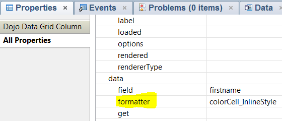
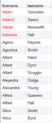
Below are examples formatter functions that use inline styles and CSS classes. Both use different approaches to change the font color to red if the name starts with ‘Ad’. The formatter function automatically receives a handle to the cell itself when its called, so you can use either the customStyles property or the customClasses property of the cell to modify the styles.
<script>
  function colorCell_InlineStyle(value, rowIndex, cell) {
    if (value.substr(0,2) == 'Ad') {
      cell.customStyles.push('color:red');
    }
    return value;
  }

  function colorCell_Class(value, rowIndex, cell) {
    if (value.substr(0,2) == 'Ad') {
      cell.customClasses.push('redCell');
    }
    return value;
  }
</script>
Dojo Data Grid – Part 33: Reading Data from a Custom REST Service
Setting the data source of a grid is generally very straightforward when using one of the provided view or Json rest services, but it doesn’t work the same way for a custom REST service. In this post, I’ll show how to get it to work.
Dojo Data Grid Series
Dojo Grids in XPages — All Blog Posts
Error Binding to a Custom REST Service
Normally, you add a REST service to the page to provide data and select it in the storeComponentId of the grid (as shown in ), but it throws an error when you do this with a custom REST service. (I tried binding the REST service to the grid based on both the id and jsId properties of the custom REST service, but the result was the same.)
The grid would not display on the page and Firebug would show this error:
ReferenceError: restService1 is not defined
Solution
In order to find a solution, I did some digging into what a pure dojo grid needs (outside of XPages) for a JSON data store.
Key points in the solution:
- Include two dojo modules in the page resources to set up the data store
- A pass-thru
scripttag with code to set up a JSON data store for the grid (uses the dojo modules that the resources specify) - The grid’s
storeproperty is set to the variable set up for the data source in the tag. (storeComponentIdneeds an XPages component name.)
Below is the entire source of an XPage that demonstrates this technique.
Lines 05-08 include two dojo modules that you need in order to set up the data source.
Lines 10-46 define a custom REST service. The pathInfo value in line 10 will be used to read the data. The majority of this is hard-coded data, which you would replace with your code to provide data for the grid.
Lines 48-53 are a standard client-side script tag that set up the data store and make it available for the grid. The jsonStore object reads the REST service data via URL path, so it needs the XPage name and the pathInfo value for the REST service. Modify this line as needed to point to the page and REST service.
Lines 55-58 define the grid, but the key is that line 55 sets the store property to the name of the JavaScript object defined in line 52.
<?xml version="1.0" encoding="UTF-8"?>
<xp:view xmlns:xp="http://www.ibm.com/xsp/core"
  xmlns:xe="http://www.ibm.com/xsp/coreex">

  <xp:this.resources>
    <xp:dojoModule name="dojo.store.JsonRest"></xp:dojoModule>
    <xp:dojoModule name="dojo.data.ObjectStore"></xp:dojoModule>
  </xp:this.resources>

  <xe:restService id="restService1" pathInfo="gridData">
    <xe:this.service>
      <xe:customRestService contentType="application/json"
        requestVar="customData2" requestContentType="application/json">
      <xe:this.doGet><![CDATA[#{javascript:// Create hard-coded test data
var jsonData = [];

var thisEntry = {};
thisEntry.Status = 'Open';
thisEntry.Name = 'John';
jsonData.push(thisEntry);

thisEntry = {};
thisEntry.Status = 'Closed';
thisEntry.Name = 'Bill';
jsonData.push(thisEntry);

thisEntry = {};
thisEntry.Status = 'Closed';
thisEntry.Name = 'Mike';
jsonData.push(thisEntry);

thisEntry = {};
thisEntry.Status = 'Open';
thisEntry.Name = 'Jim';
jsonData.push(thisEntry);

thisEntry = {};
thisEntry.Status = 'Open';
thisEntry.Name = 'Steve';
jsonData.push(thisEntry);

return toJson(jsonData);}]]>
        </xe:this.doGet>
      </xe:customRestService>
    </xe:this.service>
  </xe:restService>

  <script>
    var jsonStore = new dojo.store.JsonRest(
      {target:"CURRENT_PAGE_NAME_HERE.xsp/gridData"}
    );
    var dataStore = dojo.data.ObjectStore({objectStore: jsonStore});
  </script>

  <xe:djxDataGrid id="djxDataGrid1" store="dataStore">
    <xe:djxDataGridColumn id="djxDataGridColumn2" field="Name"></xe:djxDataGridColumn>
    <xe:djxDataGridColumn id="djxDataGridColumn1" field="Status"></xe:djxDataGridColumn>
  </xe:djxDataGrid>
</xp:view>
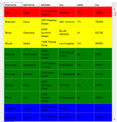
Dojo Data Grid – Part 32: Setting Row Color Based on Row Data
In this post, I’ll show how dynamically change the row color in an XPages Dojo Data Grid based on data in the row.
Dojo Data Grid Series
Dojo Grids in XPages — All Blog Posts
Conditional Row Styling
A common use case for setting the row color is to draw attention to certain rows based on the status. If an item is being shipped and it’s late, you might want to highlight it in red to make sure that it’s obvious that there’s a problem.
The client-side onStyleRow event of the grid is the key to this technique. It executes as each row is drawn in the grid, which is the timing we need in order to dynamically set the row styling. See my previous post on the onStyleRow event for more information.
CSS
In the method I’ll demonstrate, it appends a class to each row that is styled. For this to work, the class names have to correspond to CSS classes that define the row style.
Here is the CSS used in my sample:
.redRow {
  background-color:red !important;
}
.yellowRow {
  background-color:yellow !important;
}
.greenRow {
  background-color:green !important;
}
.blueRow {
  background-color:blue !important;
}
.grayRow {
  background-color:gray !important;
}
The Code
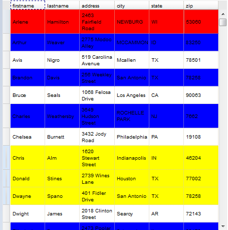
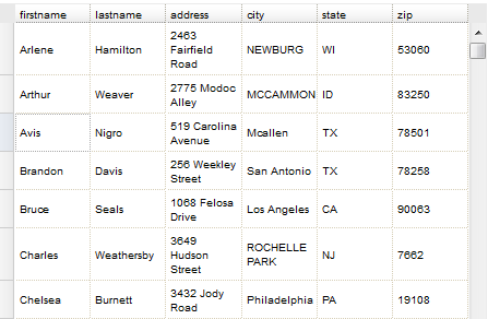
Below is the source code for a working example. Since the data I have in my test database is about people, I set it up to display different row colors if the first name starts with A, B, C, or D.
var columnNumber = 0;  // 0-based column number of the grid data to read

// This event automatically receives an object with information about the current row. It's not named, so we refer to it by arguments[0]
var row = arguments[0];

// Read the data from the specified cell in the row
var firstName = dojo.query('TD', row.node)[columnNumber].innerHTML;
if (firstName == '...') {
  return;
}

// Assign the style class based on the first letter of the first name
var rowClass = 'grayRow';
switch(firstName.substr(0,1).toUpperCase()) {
  case 'A':
    rowClass = 'redRow';
    break;
  case 'B':
    rowClass = 'yellowRow';
    break;
  case 'C':
    rowClass = 'greenRow';
    break;
  case 'D':
    rowClass = 'blueRow';
    break;
}

row.customClasses += ' ' + rowClass;
Understanding the Code
The main thing that the code needs to do is to read the row data and set the class accordingly. Now that we understand what information is available in the onStyleRow even, the code is pretty simple.
Line 1 defines the column number from which data should be read. It’s 0-based (because I’ll end up getting an array of table cells to read from and that will be 0-based). In this example, I want to read the firstname column, so it’s set to column #0.
Line 4 gets a handle to the object that is automatically passed into the onStyleRow event. It’s not named, so we refer to it by arguments[0].
Line 7 does the heavy lifting. It uses dojo.query to get all of the cells (TD) in the table for the current row. It gets the nth cell based on the column number defined in line 1; this determines which column it’s reading. It then returns the innerHTML of that cell in order to return the cell content.
Lines 8-10 account for the grid behavior that defaults each cell to ‘…’. The onStyleRow event will run twice as rows are loaded. The first time, the data will be ‘…’ and thereafter, it will be populated with the real data. So, if this is the initial pass, just exit the function for the time being and it will re-execute as the data is filled in.
The rest of the code reads the first character of the first name and determines which style class to add to the row.
The last line uses the customClasses property of the row in order to add the style class that sets the row color.
The Result
That’s it — we now have code that dynamically styles the row colors based on the data within the row!
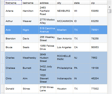
Dojo Data Grid – Part 31: Setting Row Styles on Hover, Selection, and Alternate Rows
In this post, I’ll show how change the row color in an XPages Dojo Data Grid based on whether the row is hovered over, selected, or is an odd-numbered row.
Dojo Data Grid Series
Dojo Grids in XPages — All Blog Posts
Row Styling
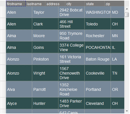
By default, the grid will provide alternate row coloring and different styles when you select or hover over a row. This image shows all three of those styles in effect.
However, as soon as you add any code into the event handler, you lose the hover, selected, and alternate row styles.
The client-side onStyleRow allows us to re-apply this styling or change it. The event executes as each row is drawn in the grid, which is the timing we need in order to dynamically set the row styling. See my previous post on the onStyleRow event for more information.
Restoring the Default Styles
To restore the default styles, you can use the same class names that the grid uses to apply the styles.
- Alternate Rows – dojoxGridRowOdd
- Row Hover – dojoxGridRowOver
- Row Selection – dojoxGridRowSelected
// This event automatically receives an object with information about the current row. It's not named, so we refer to it by arguments[0]
var row = arguments[0];

if (row.over) {
  row.customClasses = 'dojoxGridRowOver';
} else if (row.selected) {
  row.customClasses = 'dojoxGridRowSelected';
} else if (row.odd) {
  row.customClasses = 'dojoxGridRowOdd';
}
Customizing the Styles
Now that you understand how this works, it is just as easy to change the styles completely in these three cases.
Just define classes in CSS and include the style sheet on the page and you use the same technique to append classes to rows as needed.
In this hideous example, alternate rows are set to blue, selected rows are set to yellow, and the hovered row is set to red.
var row = arguments[0];

if (row.over) {
  row.customClasses = 'redRow';
} else if (row.selected) {
  row.customClasses = 'yellowRow';
} else if (row.odd) {
  row.customClasses = 'blueRow';
}
Dojo Data Grid – Part 30: The onStyleRow Event
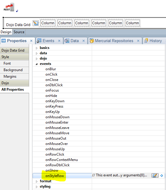
In this post, I’ll dig into the onStyleRow event of the XPages Dojo Data Grid in order to show how it can be used to modify the display of grid rows. This will lay the foundation for the next few posts.
Dojo Data Grid Series
Dojo Grids in XPages — All Blog Posts
The onStyleRow Event
The onStyleRow event runs on each row in the grid as it is rendered. The event handler automatically receives one argument that has a number of properties that can be used to conditionally customize the display of the row.
By default, the grid will provide alternate row coloring and different styles when you select or hover over a row. This image shows all three of those styles in effect.
However, as soon as you add any code into the event handler, you lose the hover, selected, and alternate row styles. (In this case, I added a single comment to the event handler and it was still enough to cause other styles to be dropped.)
onStyleRow Argument Properties
The onStyleRow event automatically receives an object with information about the current row. It’s not a named argument, so we refer to it by arguments[0]. The properties of the row object are as follows:
- index (row index)
- node (DOM node)
- odd (boolean — whether the row is an odd-numbered row)
- selected (boolean — whether the row is currently selected)
- over (boolean — whether the row is currently hovered over)
- customStyles (used to add style information to the row)
- customClasses (used to add classes to the row)
The index property is the 0-based number of the row in the grid.
odd, selected, and over are boolean properties that are handy for changing styles for alternate rows and whether the row is selected or hovered over.
The customStyles property is used to add custom style information to the row. The customClasses property is used to add additional classes to the grid row.
The node provides a handle to the DOM node of the grid row.
Here’s an example of what it returns:
</pre>
<table class="dojoxGridRowTable" role="presentation" border="0" cellspacing="0" cellpadding="0">
<tbody>
<tr>
<td class="dojoxGridCell " style="width: 6em;" tabindex="-1" role="gridcell" colspan="1">...</td>
<td class="dojoxGridCell " style="width: 6em;" tabindex="-1" role="gridcell" colspan="1">...</td>
<td class="dojoxGridCell " style="width: 6em;" tabindex="-1" role="gridcell" colspan="1">...</td>
<td class="dojoxGridCell " style="width: 6em;" tabindex="-1" role="gridcell" colspan="1">...</td>
<td class="dojoxGridCell " style="width: 6em;" tabindex="-1" role="gridcell" colspan="1">...</td>
<td class="dojoxGridCell " style="width: 6em;" tabindex="-1" role="gridcell" colspan="1">...</td>
</tr>
</tbody>
</table>
<pre>
There are two interesting things to note. First of all, each row in the grid is actually its own table. Secondly, each cell in the row is initially populated with ‘…’. It then fills in the data from the REST service on a second pass.
This is important to understand — the onStyleRow event will generally run more than once on each row. Essentially, whatever settings are applied in the last pass are the ones that stick.
In my testing, it appears to run between 1 and 3 times on each row. It seems to most commonly run twice — once when it sets up the row and pre-populates every cell with ‘…’ and then a second time when it actually fills in the data. (I tested this by reviewing the full contents of the row node.)
It seems to run 3 times on the first chunk of rows displayed when the grid is first loaded. It only runs once one when the data has already been loaded or if the row is read-protected and thus cannot display any data.
Adding event code
I enter code for the onStyleRow event via the All Properties tab and not directly in the event view. Take a look at this post to see why this works differently.
Up Next
Now that we’ve explored what happens in the event and what’s available to it, the next couple of posts will show how to use the event to provide additional row styling.
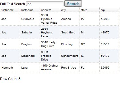
Dojo Data Grid – Part 29: Displaying the Row Count
In this post, I’ll show how display a row count for the grid and update it after executing a search.
Dojo Data Grid Series
Dojo Grids in XPages — All Blog Posts
All About the Timing
The grid has a rowCount property which will generally return the number of rows in the grid.
It will work fine if you check it by clicking a button after the page loads. However, if you run this immediately as the page loads (even if it’s in the onClientLoad event), it will return 0, because the grid hasn’t been drawn out yet).
At this point, my solution is to introduce a delay to give it time — then it can return the correct amount.
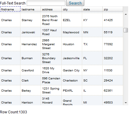
Displaying the Count
One simple way to display the count is to put a simple span tag on the page, add a class to it so it can be programmatically updated.
I added this to my page:
Row Count: <span class="displayRowCount"></span>
Updating the Count
Another consideration is that you don’t just want to check the count when the page loads, you’ll want it to be updated any time the grid is refreshed.
In the post where I showed how to add search to a grid I mentioned that executing a search must refresh the rest service and the grid, so you should put them both in a panel and target that panel with a partial refresh.
To finish this solution, add code that will check the grid’s row count and update the display (span) tag on the onClientLoad event of the panel, so it re-runs every time the panel is refreshed.
var t=setTimeout(function(){
    var myGrid = dijit.byId('#{id:djxDataGrid1}');
    dojo.query('.displayRowCount')[0].innerHTML = myGrid.rowCount;
  }
,500);
This code waits half of a second (500 milliseconds) and then checks the grid’s row count (line 2) and updates the span tag to display it (line 3).
These screen shots show the row count below the grid after initial load and then after a search:
REST Service Note
I tested this with a JSON rest service as the source for the grid. Interestingly, the service’s count property is set to 20, so it shouldn’t be retrieving the full set of rows, but it returns the full count of over 1,300 anyway.
Dojo Data Grid – Part 28: Overriding Grid CSS
In the last post, I showed how to modify the look and feel of a Dojo Data Grid in XPages by selecting a different dojo theme. In this post, I’ll show how to further customize the UI by adding your own CSS.
Dojo Data Grid Series
Dojo Grids in XPages — All Blog Posts
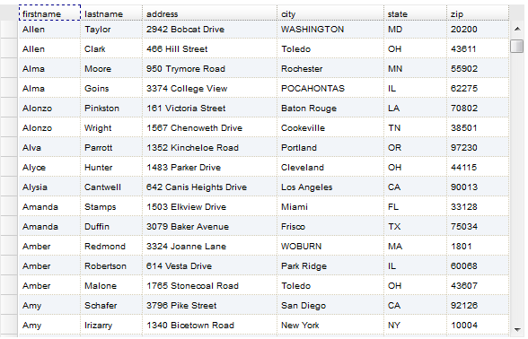
Default Style
Here’s what the grid looks like by default:
Grid Classes to Target
In order to figure out how to override the styling, we need to understand more about the structure of the grid on the page.
There are a lot of divs and tables that get generated when a grid is rendered. There’s a parent grid div, header and view divs, scrollbox and content divs, and then each grid row is a div and table.
Here’s a list of elements that it uses from the start of the grid down to the first data cell:
div.dojoxGrid > div.dojoxGridMasterView > div.dojoxGridView > div.dojoxGridScrollbox > div.dojoxGridContent > div[role="presentation"] > div.dojoxGridRow > table.dojoxGridRowTable > tbody > tr > td.dojoxGridCell
Every other div.dojoxGridRow also gets the dojoxGridRowOdd class as well.
Font and Row Color
Fortunately, we don’t need to go through all of that to find the classes that we need to customize.
You can change the row color and font by targeting .dojoxGridRow tr
/* Grid Row - Default Styles */
.dojoxGridRow tr {
  background-color: #2F4F4F;
  color: #FFFFFF;
  font-size: 14px;
}
Fixing Header/Cell Alignment with Column Widths
Once you start changing default fonts (or padding), it throws off the alignment of the column headers to the column data.
The simplest way to fix this is to define the width of each grid column explicitly in the grid column properties. This ensures that the header and cell line up.
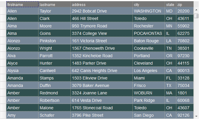
Alternate Row Color
You can also change the alternate row color and font by targeting .dojoxGridRowOdd tr
/* Grid Row -- Alternate Row Background Color*/
.dojoxGridRowOdd tr {
  background-color: #778899;
}
Row Hover
It’s a little trickier, but you can also override the row hover styles. In this case, I’m changing the background color, text color, and font size.
/* Grid Row - Hover Styles */
.dojoxGridRow tr:hover td {
  background-color: white !important;
  color: #2F4F4F !important;
  font-size: 18px;
}
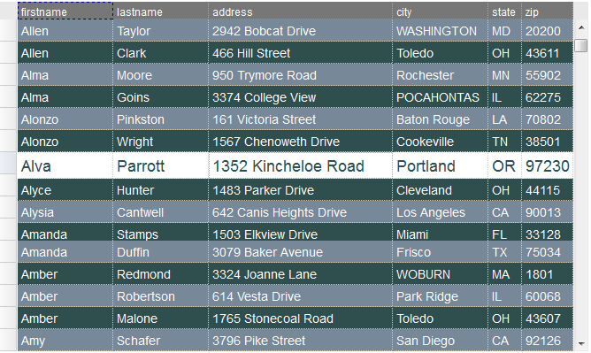
Header
You can also modify the style of the column header cells. You have to target both the header cell and the div contained within the header cell in order to fully change the background color, which uses an image by default.
/* Grid Header - Styles */
.dojoxGridHeader .dojoxGridCell {
  background-image: none !important;
  background-color: #777777 !important;
}

.dojoxGridHeader .dojoxGridCell div {
  color: white;
  font-size: 12px;
}
 Xcellerant